Today, we’re dissecting Tokyo – a metropolis where functionality meets culture, through the eyes of a Product Manager and UX designer. Let’s dive into the intricacies that make Tokyo a design marvel.
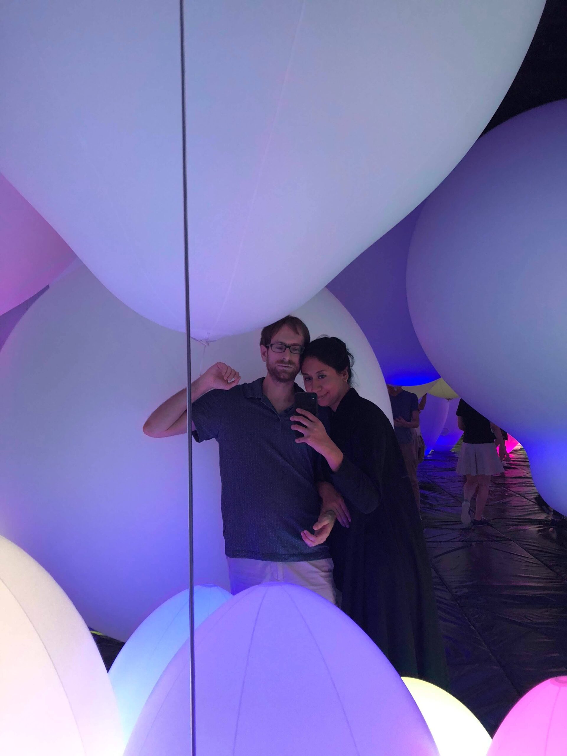
We travelled to Tokyo during the summer of 2018 to finally realize my childhood dream. My husband and I were at the time working together on a product with a client in California. Staying up until 4 am to take meetings was my least favourite part but seeing the sunrise in Tokyo as many times as I did was worth it.

Urban Choreography: Tokyo’s Ingenious Organization
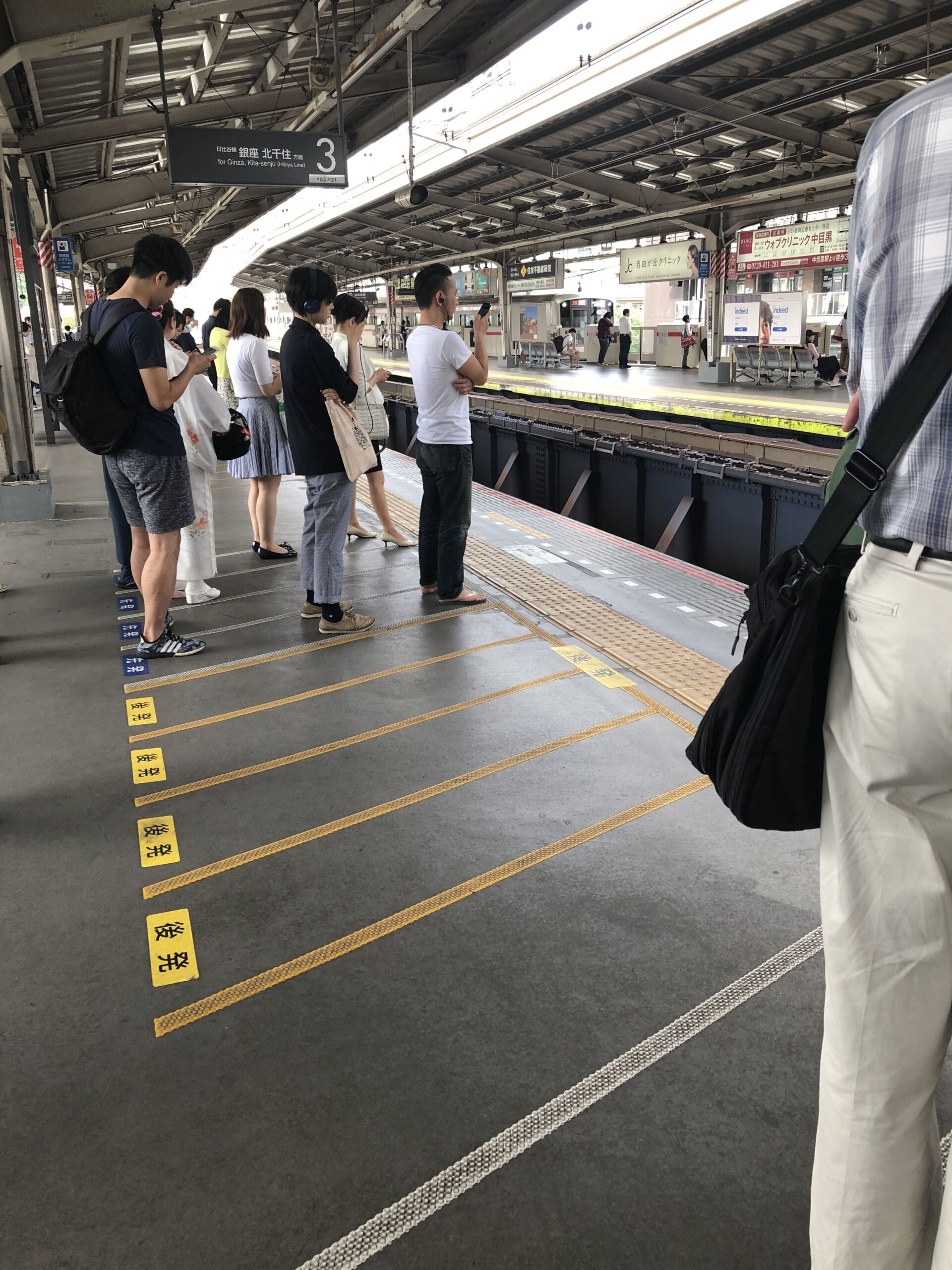
Stepping onto Tokyo’s streets is like stepping into a well-crafted user interface. If you’ve ever marveled at how effortlessly people move here, you’re not alone. The seemingly simple lines on the ground play a vital role in directing foot traffic, queueing for transport, and even designating spaces for smokers. As a product manager, this orchestrated movement reminds me of a smooth user journey – intuitive and deliberate.
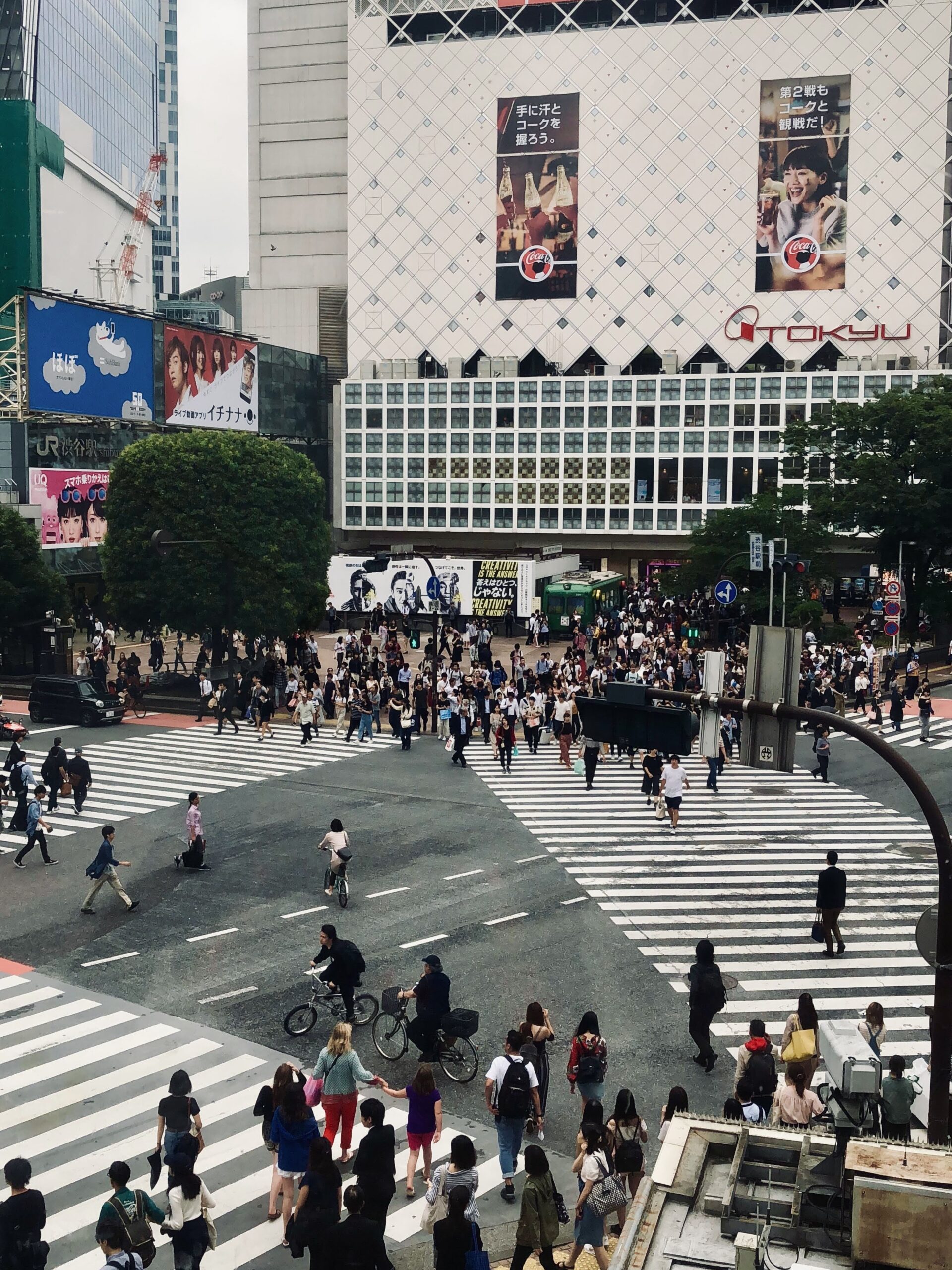
The kicker? Tokyo’s navigation patterns are a game-changer, particularly if you’re accustomed to Western layouts. It’s akin to changing the layout of a website. At first, it’s baffling, but eventually, it becomes intuitive. It’s an eye-opener for designers: users adapt, and we can’t be afraid to challenge conventions for a better experience.
When Language Takes a Back Seat: Designing for All
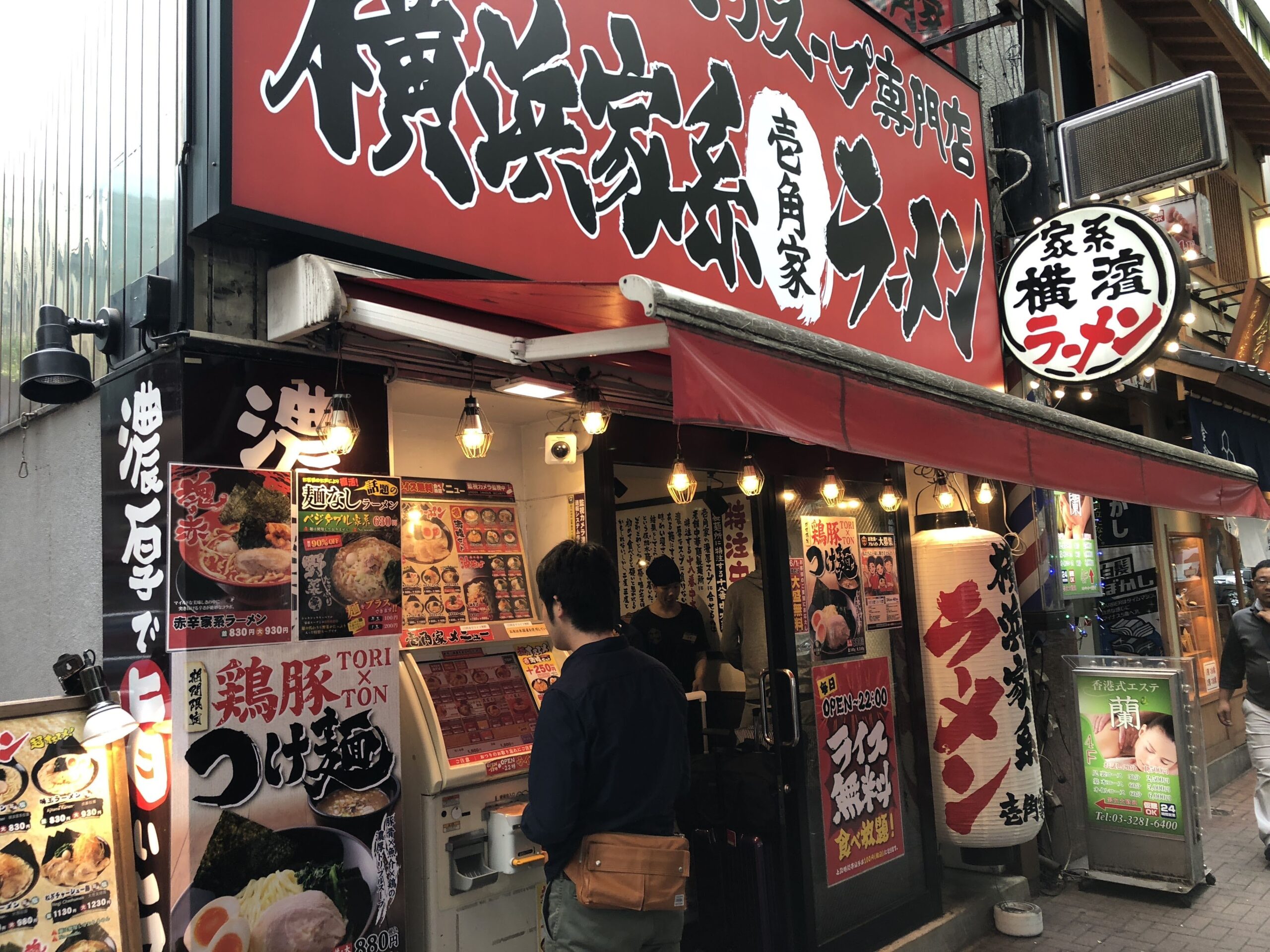
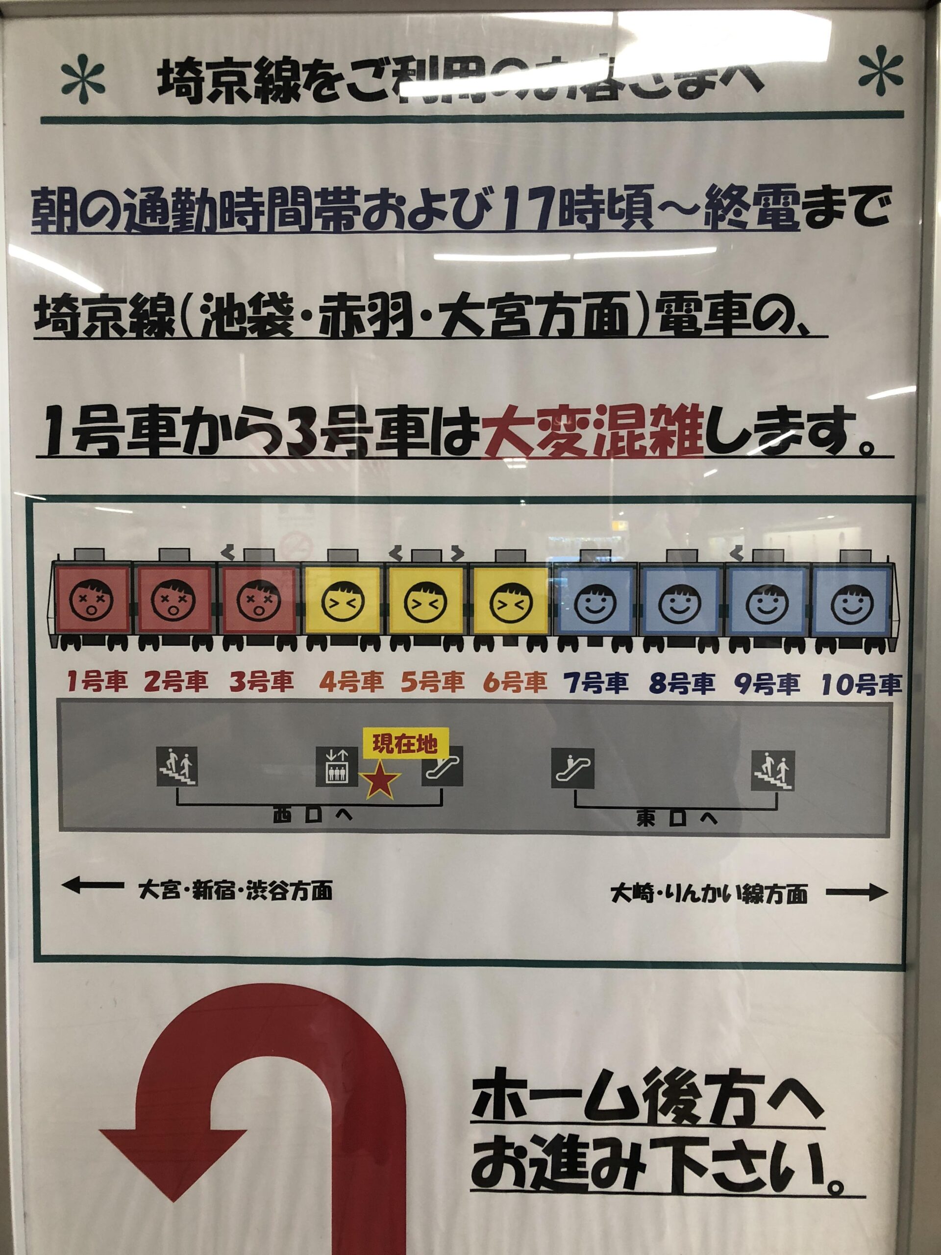
In a city where signs and announcements can leave non-Japanese speakers bewildered, Tokyo throws us a design curveball. This is where UX principles come into play. Just as an app caters to diverse languages, Tokyo’s visual cues transcend words. Think of it as user-friendly icons replacing text-heavy interfaces. It’s a reminder that excellent design bridges the language gap.
An anecdote from our Tokyo stay resonates. In our Nakameguro Airbnb, we spotted a window sealed with black tape. Our curiosity unveiled a surprising balcony. It turns out, Tokyoites use this simple trick to dim the city’s neon lights for a peaceful sleep. Context matters, reminding us to design with users’ situations in mind.
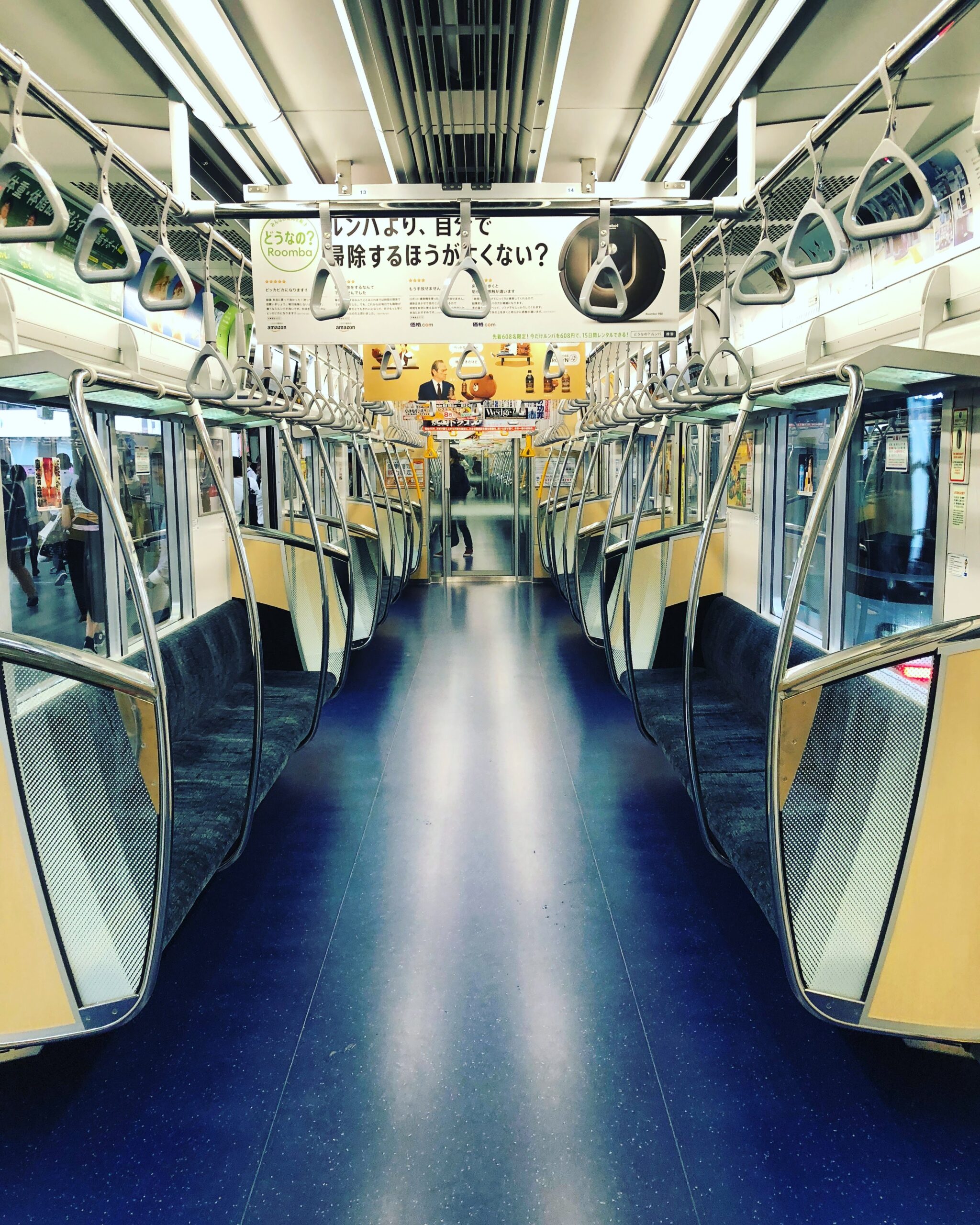
Subway Stations: More Than A-to-B
Tokyo’s subway stations aren’t just transit points; they’re showcases of creativity. As a product manager, I’m intrigued by the immersive experience these spaces offer. Digital displays, murals, and vibrant ads craft a journey beyond commuting. It’s a reminder that design extends beyond screens – it shapes emotions and perceptions.
In conclusion, Tokyo is a design masterpiece packed with lessons. Adaptability matters; users adjust, and design should evolve. Language isn’t everything; intuitive visuals speak volumes. Contextual design is key; understanding users’ surroundings enhances experiences.
Stay tuned as we unveil more global wonders. Until next time, keep exploring!